Bnoon.
A hospital for the smallest visitors.
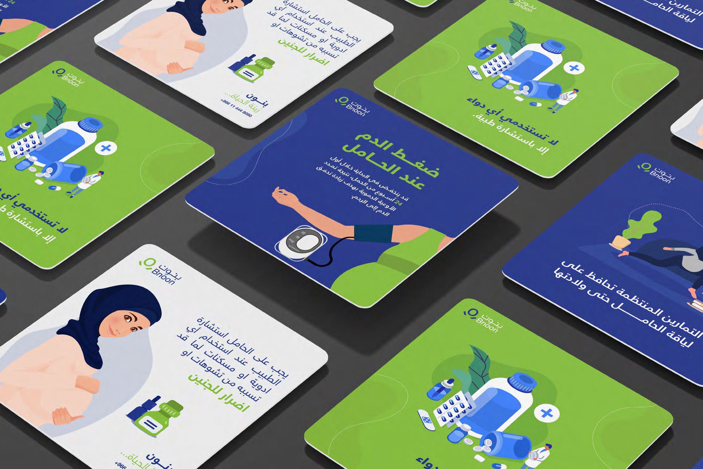
The work included writing, designing, and scheduling social media posts.
Client
Bnoon
Services
Content & identity
Industry
Social
Date
2023
The approach
Every post feels like a coffee.
Bnoon is a hospital network for children, pregnancy and birth — the word "بنون" carries the soft Arabic affection of *dear ones*. We softened the Arabic logotype into rounded counters and paired it with a stylised green "O" inside the Latin "Bnoon" — a small circle that doubles as a heartbeat dot, a stethoscope head, and the womb. The palette is hospital-clean white with a single living green; the typography is open, kind, and never clinical. Across every brochure, room number plate, and welcome card, the voice is hushed and reassuring — nothing here is shouted.
Deliverables
- Bilingual logotype + dot-mark system
- Wayfinding & department signage
- Welcome pack (mother, baby, family)
- Discharge book, brochures, room collateral
- Web + appointment-booking flow
![]() Looking for an identity that fits your name?
Looking for an identity that fits your name?