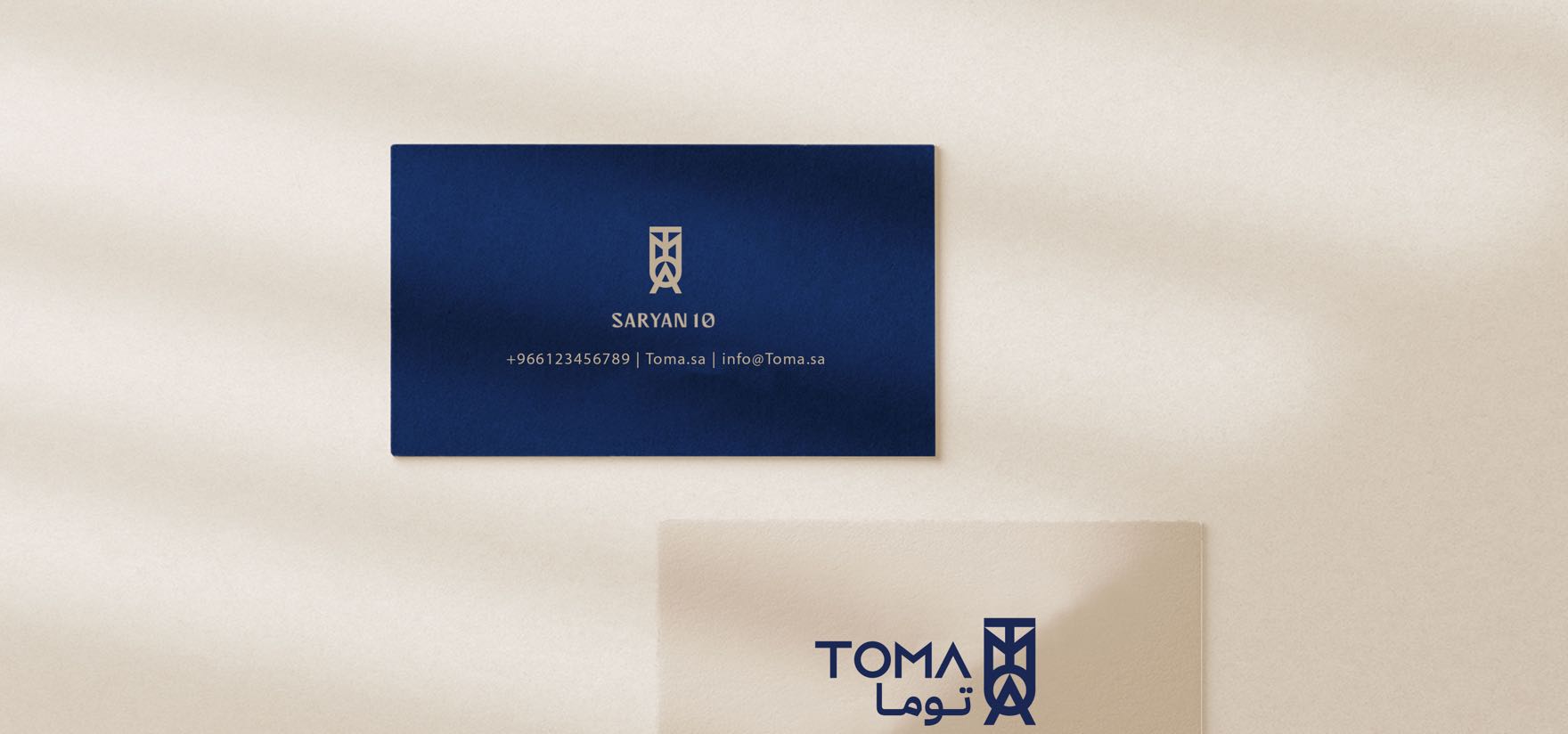
TOMA.
The Aegean, served in Riyadh.
The work covered the logo and the full visual identity for the project.
Client
TOMA
Services
Visual identity
Industry
Hospitality & F&B
Date
2022 — 2024
The approach
The craft of the kitchen, and the craft of the brand.
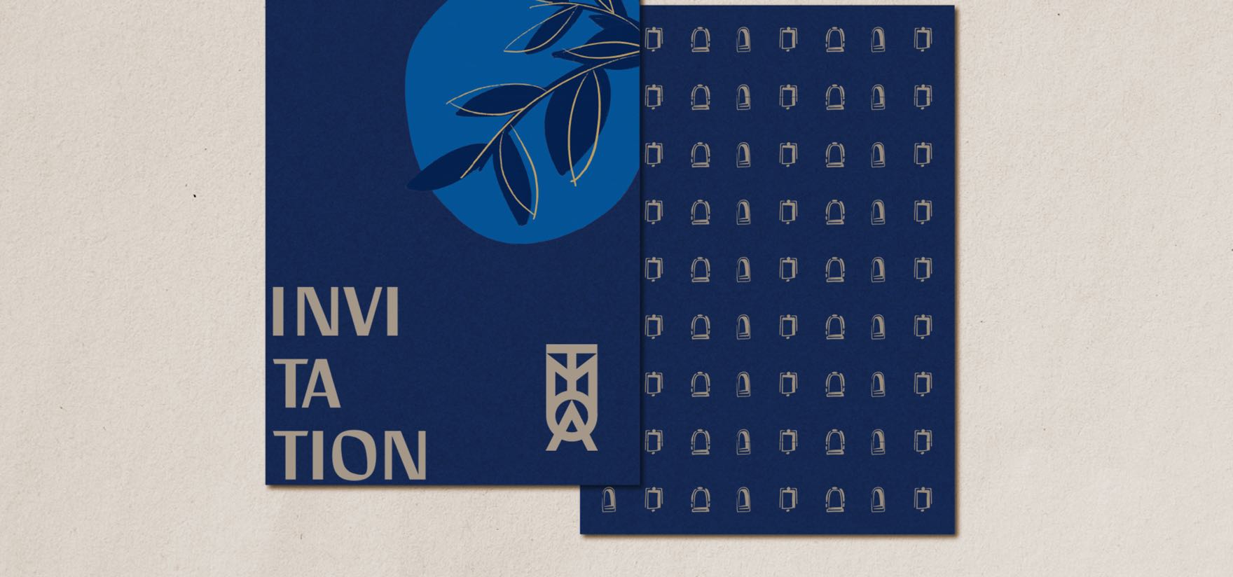
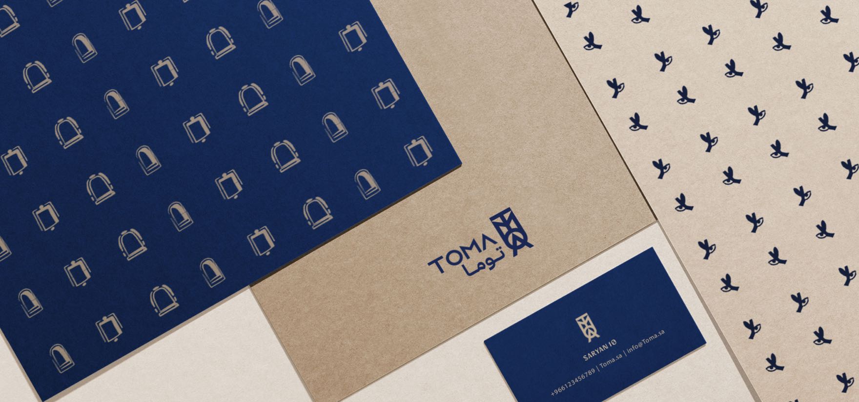
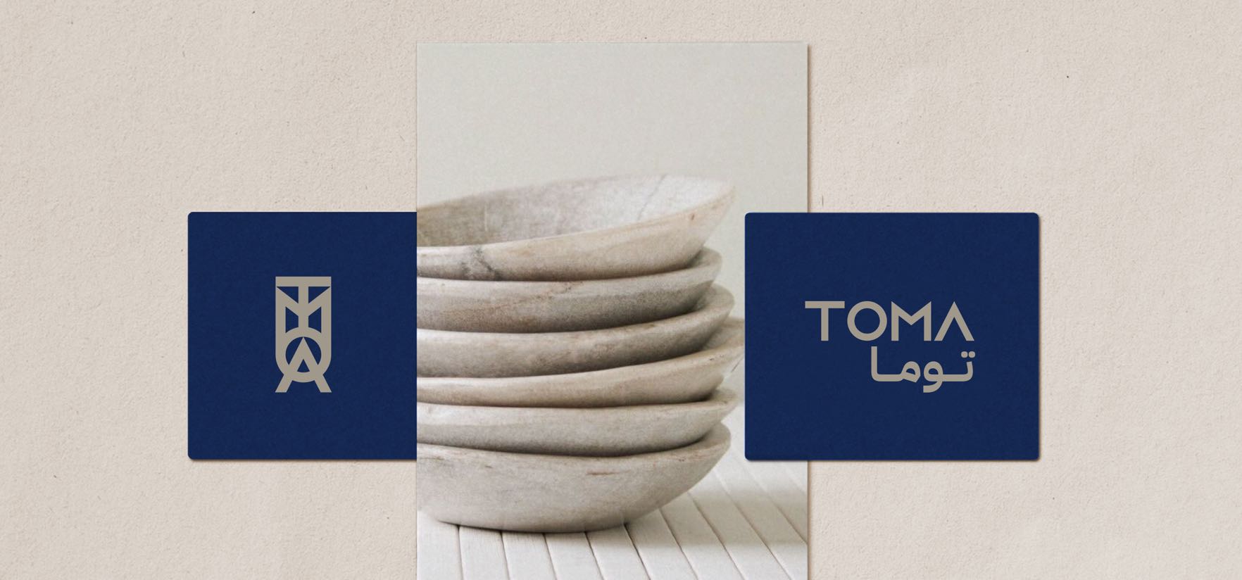
TOMA brings a Greek fine-dining table to the heart of Riyadh — olive, salt, slow flame, white plates that ring like temple stone. We carved the wordmark in clean stencil capitals, the kind of letters you find chiselled into Aegean marble, and paired them with a vertical "TM" emblem that reads as a column capital reduced to its essence. Deep Mediterranean navy carries the night sea; off-white plaster gives every surface the calm of a Cycladic wall. The bilingual lockup (TOMA / توما) lets Riyadh diners feel both worlds at the table.
What we delivered
Five deliverables, designed to read in Arabic as they read in Greek — from the wordmark down to the matchbook.
- Bilingual logotype + emblem
- Menu typography & paper system
- Plate, napkin & matchbook details
- Server uniform & door signage
- Booking-page layout for the website
Between two worlds
An identity that sits between two worlds at one table — it reads in Arabic as it reads in Greek, keeping a Riyadh diner in both places without leaving the chair.
![]() Looking for an identity that fits your name?
Looking for an identity that fits your name?