ALMO'EL.
The haven, in a cup.
The work included designing the logo and visual identity for the project.
Client
Almo'el
Services
Visual identity
Industry
Hospitality
Date
2021
The approach
The guest left the city before arriving.
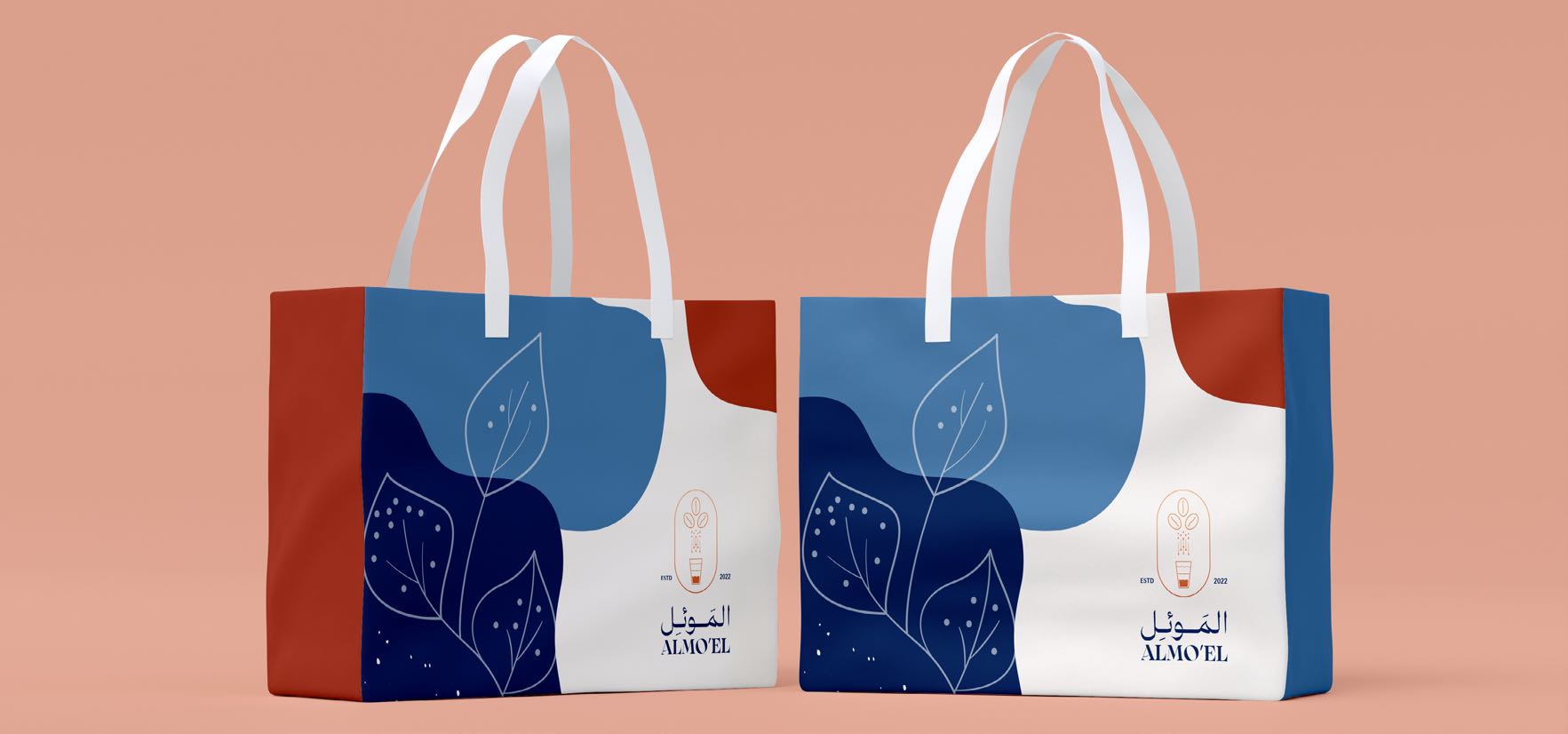
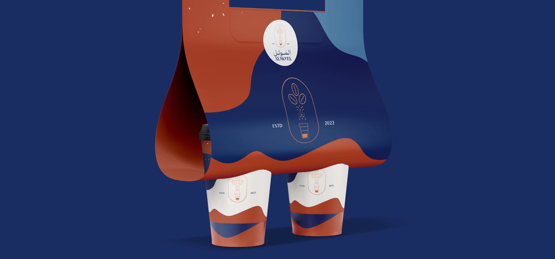
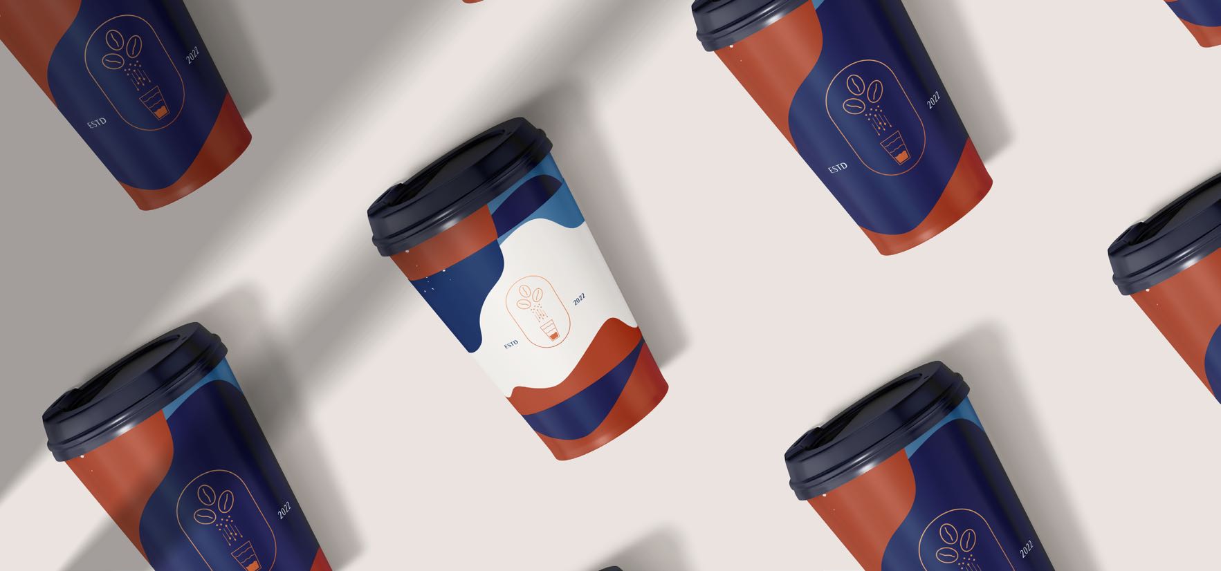
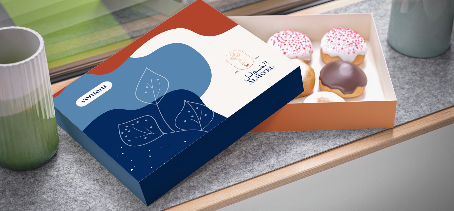
"Almo'el" — the refuge, the place you turn to. We designed it for a specialty coffee project that wants to be that place for its regulars: low light, slow conversation, the quiet cup. The Arabic "الموئل" was set in a refined classical hand, generous in its counters, balanced on a single horizontal stroke that doubles as the bench you sit on. The English "ALMO'EL" sits underneath in a quieter weight. Bone, espresso, and unfinished oak carry the rest.
Deliverables
- Classical Arabic logotype + Latin lockup
- Cup, sleeve & retail-bag packaging
- Menu & origin-card system
- Counter, signage & interior moments
- Loyalty card + grab-and-go labels
![]() Looking for an identity that fits your name?
Looking for an identity that fits your name?